%20v01.webp)
A trading chart is a visual tool that shows how the price of an asset moves over time. It helps traders and investors analyse past performance, spot trends, and anticipate future market behaviour. Whether you’re trading forex, stocks, or cryptocurrencies, understanding how to interpret these charts is essential for timing your entries and exits with more precision.
Quick summary
- Charts plot price action over time using vertical (price) and horizontal (time) axes.
- Common chart types include line, bar, and candlestick charts.
- Traders analyse support, resistance, and trends to find potential trade setups.
- Indicators and volume add context to raw price data.
- Multi-timeframe analysis improves confidence in chart signals.
Understanding axes, timeframes, and price bars
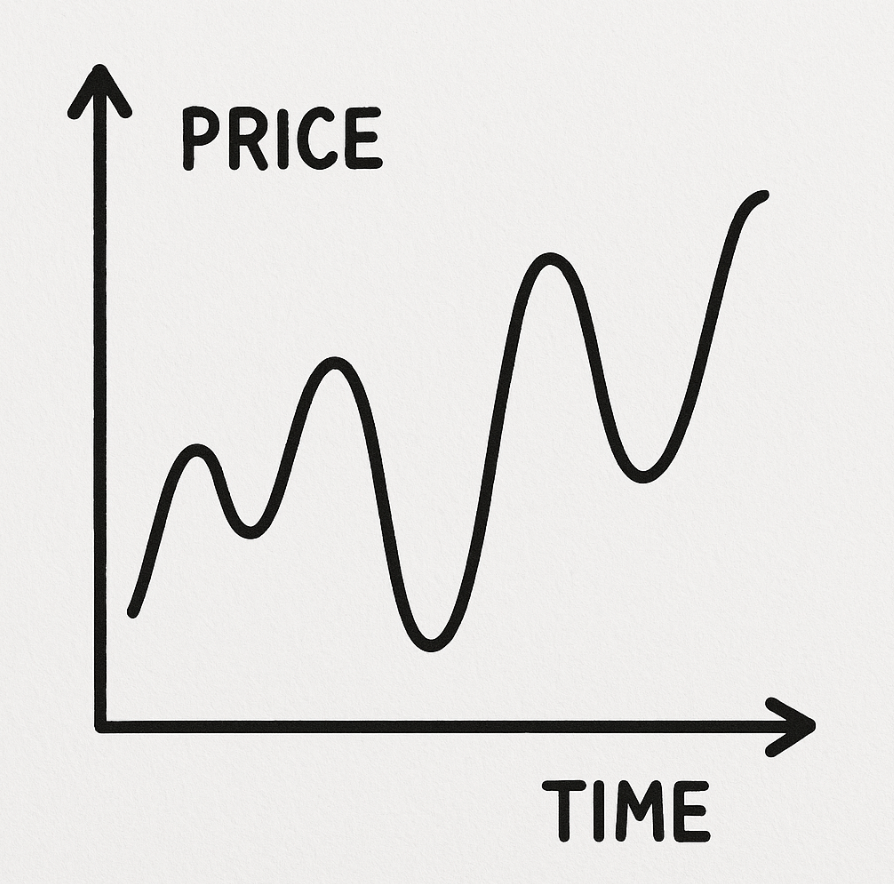
Every trading chart has two core dimensions: price (Y-axis) and time (X-axis). The vertical axis shows how high or low an asset’s price goes, while the horizontal axis represents the time interval, ranging from minutes to months.
Timeframes affect what trends you see. A 5-minute chart may show short-term noise, while a daily chart reveals the broader trend.
Price bars represent the asset’s behaviour during each time interval. Depending on the chart type, bars show the open, high, low, and close prices.
What are the commonly used chart types: Line, bar, candlestick
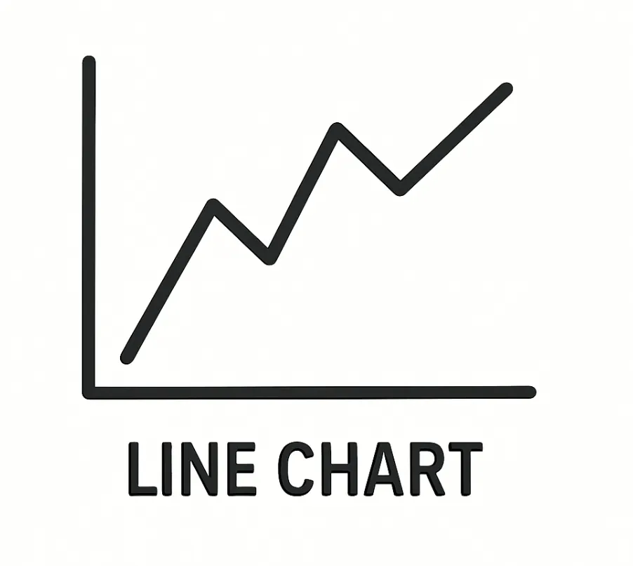
Line charts connect closing prices with a single line, offering a simple overview of price direction. They’re useful for spotting long-term trends but lack detail on intraday action.
Bar charts display each period’s open, high, low, and close. They’re ideal for evaluating volatility, with the bar height reflecting the range. Short horizontal lines mark the open (left) and close (right).
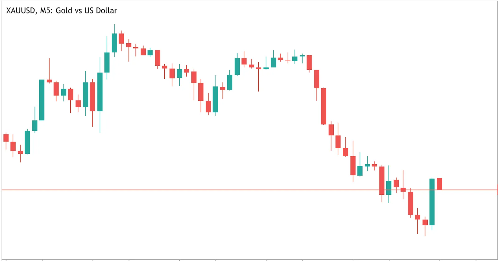
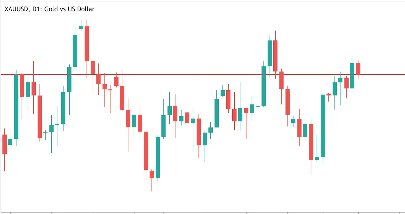
Candlestick charts, the most popular type, show the same information as bar charts but with more visual clarity. Each candle has a body (open to close) and wicks (highs and lows). Colour-coded bodies help traders spot bullish or bearish periods at a glance.

How to identify support and resistance zones
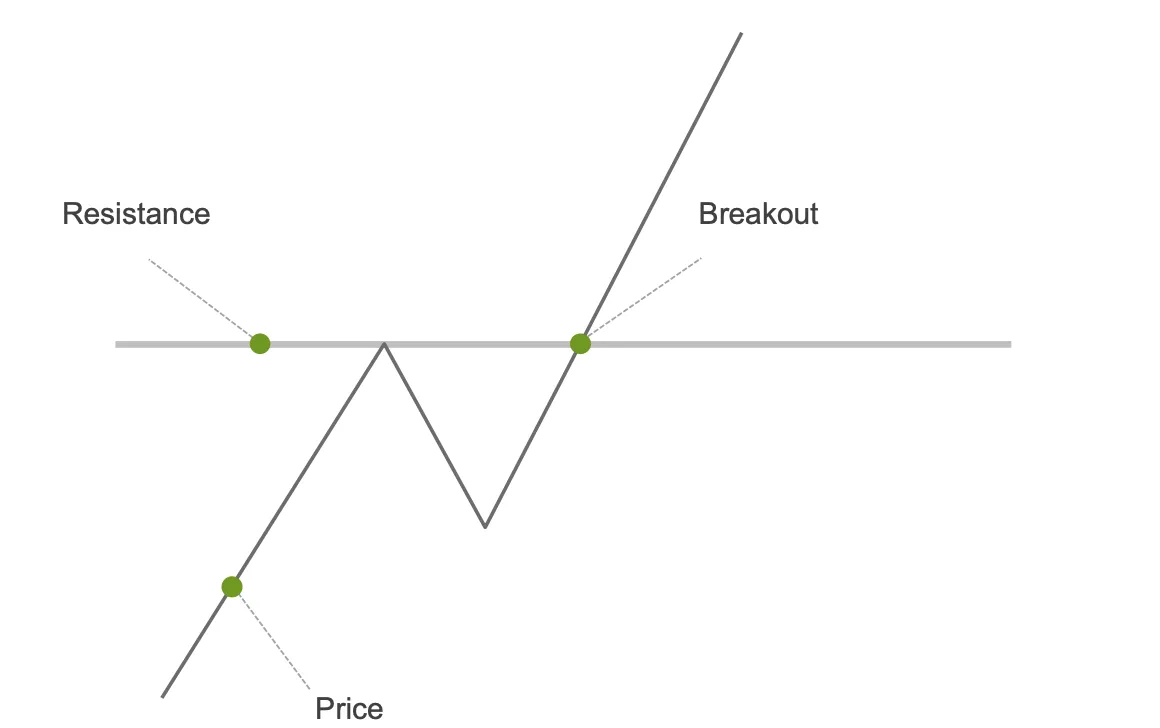
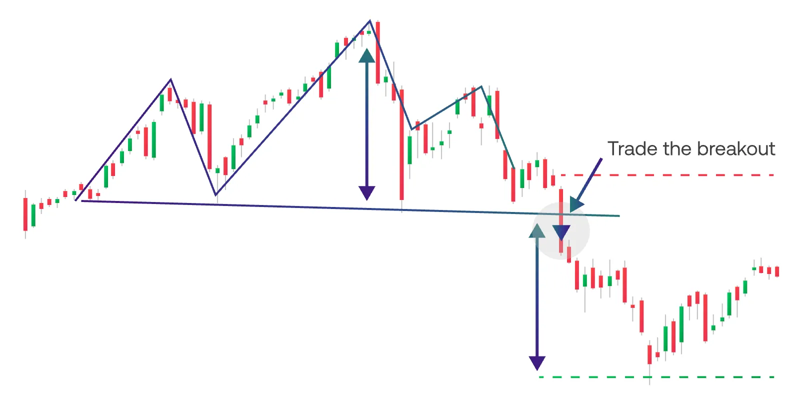
Support and resistance are vital in trading. Support is a price level where downward moves tend to pause, as buying pressure increases. Resistance is where upward moves stall due to selling pressure. These are not exact price points but rather zones formed by repeated price behaviour.
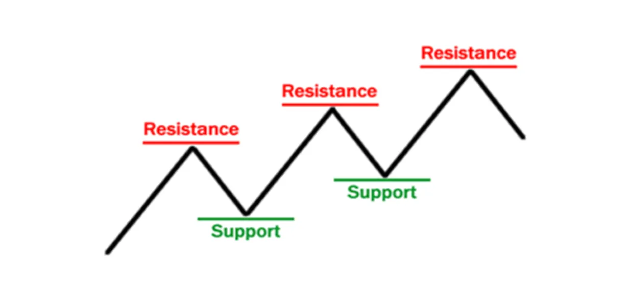
When price repeatedly tests but doesn’t break support or resistance, those levels are considered stronger. Traders often look to buy near support and sell near resistance - or trade the breakout when those levels are breached.
Recognising trends and chart patterns
Market trends are the foundation of chart analysis. An uptrend forms when the price makes higher highs and higher lows, while a downtrend is characterised by lower highs and lower lows. A sideways trend (or consolidation) shows price moving within a horizontal range.
Common chart patterns include:
- Breakouts (price escaping a range)
- Reversals (head and shoulders, double tops/bottoms)
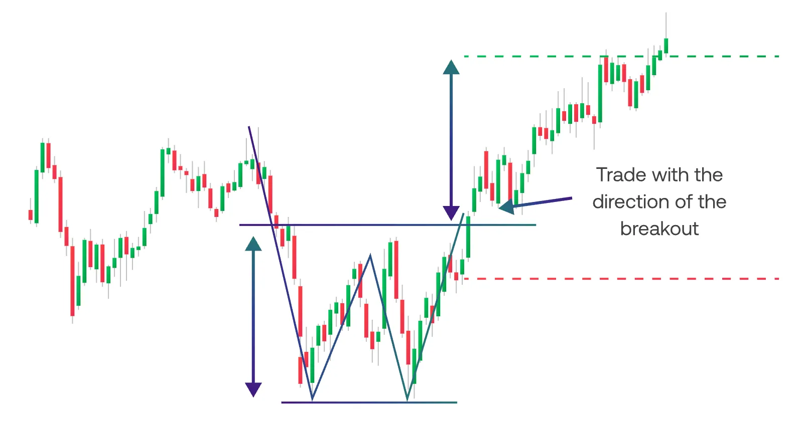
- Continuations (flags, triangles, wedges)
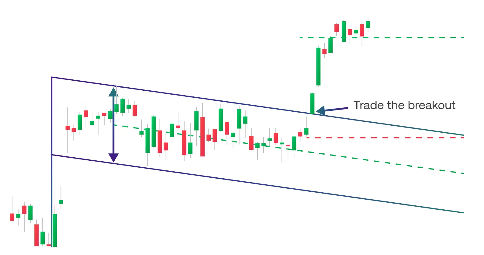
Patterns are used to anticipate future moves, especially when confirmed by volume or indicators.
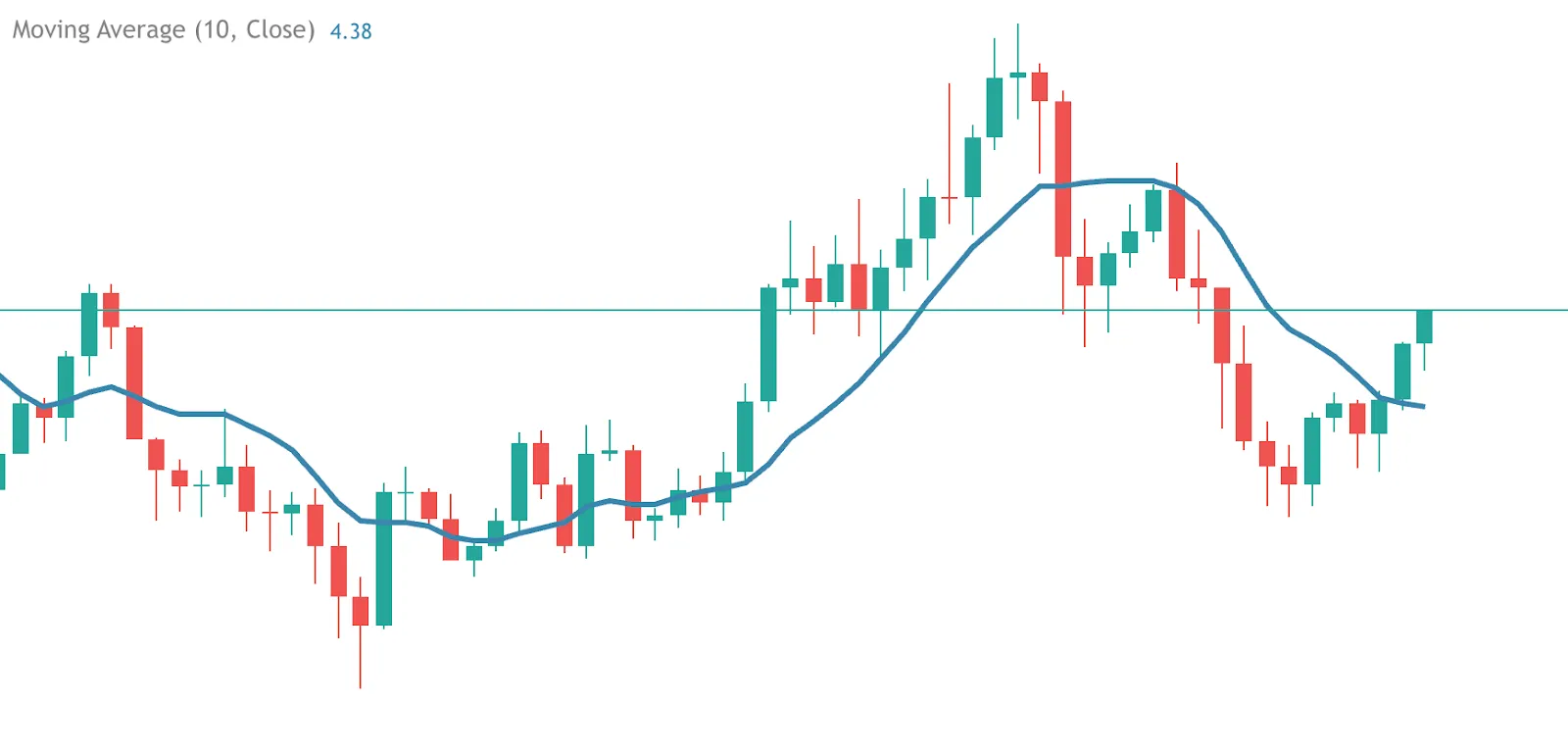
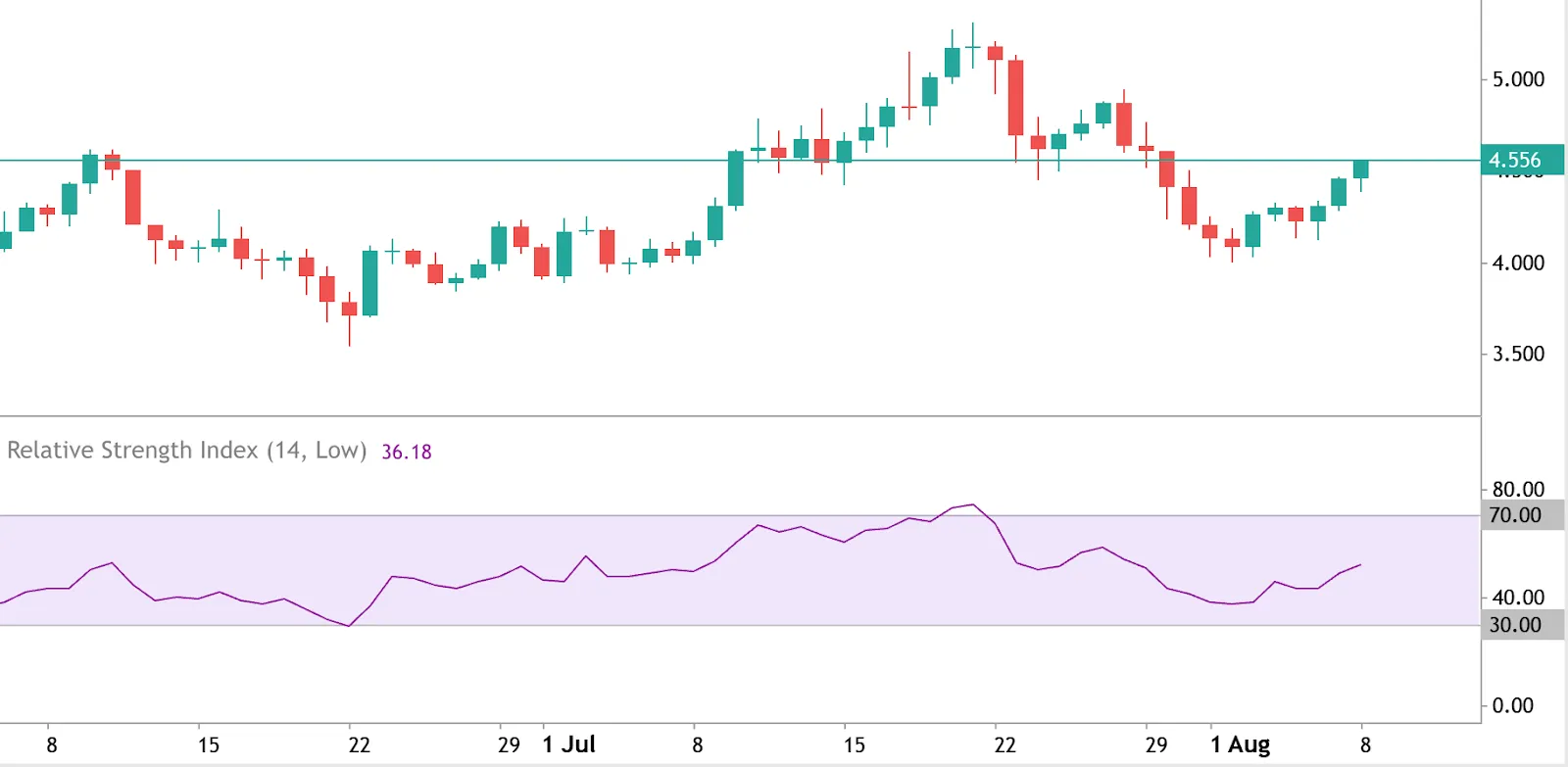
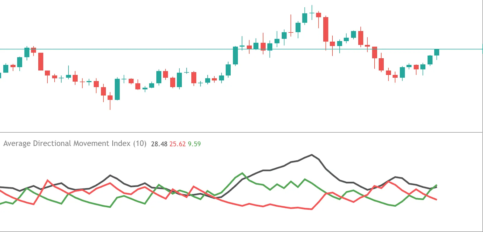
How to use indicators with charts
Indicators add a quantitative layer to visual price action. Popular tools include:
- Moving Averages: Smooth out price trends.
- RSI (Relative Strength Index): Measures momentum and overbought/oversold conditions.
- MACD: Tracks trend changes using exponential averages.
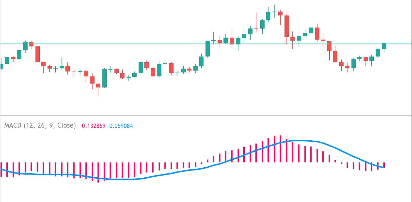
- ADX: Evaluates trend strength.
- Volume-based indicators: Confirm buying/selling conviction.
Rather than relying on one signal, traders combine two to four complementary indicators to reduce false positives.
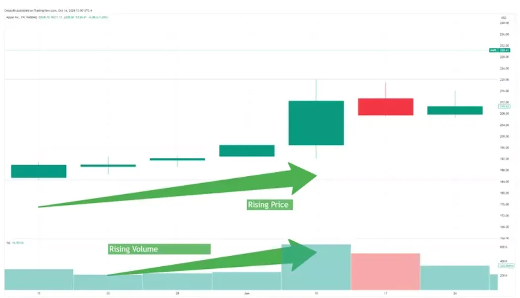
How to find volume data in trading charts
Volume shows how many trades occurred in a given time. It’s often displayed as vertical bars at the chart’s bottom. High volume during a price move indicates strong conviction, while low volume may suggest weakness.
- Rising price with rising volume = strength.
- Falling price with rising volume = strong selling pressure.
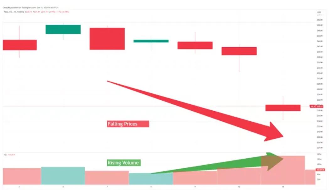
Volume spikes often precede breakouts or reversals. Using volume helps validate patterns and filter out noise.
How to read a trading chart: Step-by-step
- Choose a chart type that suits your strategy - candlesticks are great for detail.
- Set the timeframe based on your trading horizon (e.g. 1H for day trades, 1D for swing trades).
- Identify the trend using highs/lows or trendlines.
- Mark support/resistance by finding repeated turning points.
- Use volume and indicators to confirm patterns or breakouts.
- Look at multiple timeframes to validate the setup.
Consistency is key - repeat this process to build confidence in real-time analysis.
Reading trading charts isn’t about memorising every pattern or indicator. It’s about learning how price behaves, identifying meaningful patterns, and aligning that information with your strategy. Start with one chart type, master basic tools like trendlines and moving averages, and gradually build your toolkit. The more charts you analyse, the more intuitive the process becomes.
Quiz
What do the vertical and horizontal axes on a trading chart represent?
FAQs


.webp)